JPEG Does Not Just Look Worse on Text — It Is Bigger Too
The usual advice is "JPEG for photos, PNG for graphics", and it is given as a quality argument: JPEG smears the edges of text and flat color. That is true, and it buries the more useful half. On the same image, at the same settings, the JPEG is also the bigger file — three times bigger on a page of text. You are not trading size for quality. You are losing both.
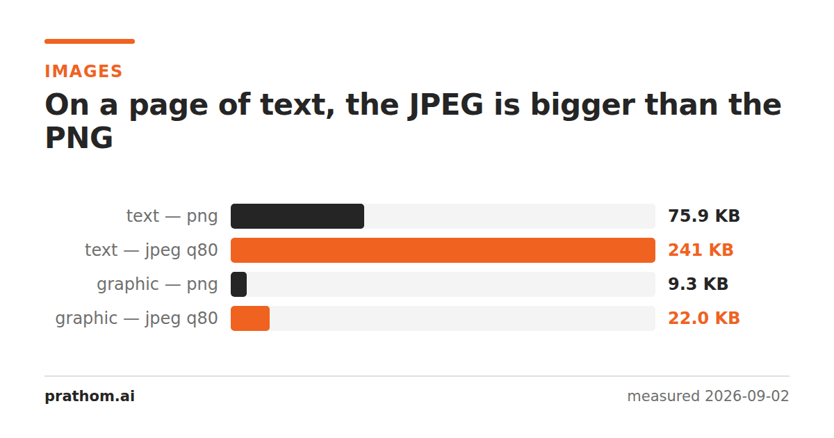
Take four images, all 1600×1200, all saved from the same source PNG at ImageMagick's default JPEG quality of 80. Here is what came out.
| image | PNG | JPEG q80 | change |
|---|---|---|---|
| photograph | 1,917,409 B | 158,774 B | −92% |
| flat graphic | 9,484 B | 22,502 B | +137% |
| page of text | 77,673 B | 247,092 B | +218% |
| shape with transparency | 10,629 B | 22,438 B | +111% |
The photograph behaves the way the advice says. The other three go the wrong way, and the text page goes the wrong way by a factor of three.
Why a lossy format makes a bigger file
JPEG works by throwing away high-frequency detail — the parts of an image that change fast from pixel to pixel. A photograph is mostly low frequency: skies, skin, out-of-focus backgrounds, gradual shifts. Very little of it is fast-changing, so very little survives the cut, and the file collapses.
A page of black text on white is the opposite. Every letter edge is a hard transition from full black to full white inside one or two pixels. That is high-frequency content everywhere, on every line. JPEG cannot discard it without the page becoming unreadable, so it keeps encoding it — expensively, one 8×8 block at a time, for the whole page.
Meanwhile PNG is doing the thing it is good at. It compresses losslessly by predicting each pixel from its neighbors and storing the difference. On a page that is mostly pure white, most of those differences are zero, and a run of zeros costs almost nothing. The flat graphic is the same story: large areas of one color compress to nearly nothing, and JPEG turns each of those flat areas into a field of faint ringing that has to be stored.
The ringing is the cost you can see
Around every high-contrast edge a JPEG leaves a halo — a few pixels of the wrong color, alternating light and dark. On a photograph nobody notices. On a screenshot of a spreadsheet, it is gray mush around every gridline. On a logo, it is a dirty fringe on what should be a clean edge against white.
That is why the quality argument is the one people make. The size argument is stronger, though, because it removes the trade-off entirely. There is no version of "I will accept the fringing to save bandwidth", because you are not saving any.
What to use instead
For anything with text, flat color, or hard edges, the measured order was:
| format | text page | flat graphic |
|---|---|---|
| WebP lossless | 10,984 B | 3,170 B |
| PNG (max compression) | 75,072 B | 7,005 B |
| PNG (default) | 77,673 B | 9,484 B |
| GIF | 133,436 B | 9,136 B |
| JPEG q80 | 247,092 B | 22,502 B |
WebP lossless was not only the smallest, it was pixel-for-pixel identical to the source — zero of the 1,920,000 pixels differed. It is a lossless format that happens to compress this kind of content far better than PNG does. If your audience is on any browser from the last several years, that is the answer for screenshots, logos and diagrams.
If you need PNG for compatibility, the max-compression setting cost nothing but a little encoding time and saved 3% on the text page and 26% on the graphic.
How to repeat this
Nothing here is a claim about our tools; it is a claim about the formats, and you can check it in four commands:
magick -size 1600x1200 xc:white -fill black -pointsize 24 \
  -annotate +50+60 "any paragraph you like" text.png
magick text.png -quality 80 text.jpg
magick text.png -define webp:lossless=true text.webp
ls -l text.png text.jpg text.webp
The absolute numbers will move with your text and your ImageMagick build. The ordering will not.
The one case where JPEG wins on a graphic
If the "graphic" is really a photograph with some text on top — a product shot with a price badge, a screenshot of a video — the photographic area dominates and JPEG wins again. The rule that actually works is not about the file's purpose but about its content: count how much of the image is flat or hard-edged. If most of it is, JPEG will cost you size and quality at the same time.
What about lossy WebP?
If JPEG is the wrong lossy format for this content, the obvious question is whether a better lossy format fixes it. It helps, and it does not rescue the idea.
Lossy WebP at quality 80 produced 146,742 bytes for the text page — a large improvement on JPEG's 247,092, and still nearly twice the size of the plain PNG, and still lossy. It changed 226,163 pixels. Lossless WebP produced 10,984 bytes and changed none of them. When the lossless option is both smaller and perfect, the lossy option is not a trade-off you are making, it is a mistake you are making.
The one place the ordering flips is a screenshot of a photograph — a video still, a map, a product page with a large hero image. Once most of the frame is continuous tone, the lossy formats win again, and the text sitting on top is a small penalty rather than the whole cost.
Why the advice got fixed in this shape
"JPEG for photos, PNG for graphics" is not wrong, and it is worth understanding why it survives as a quality argument rather than a size one. It dates from a period when the alternative to JPEG really was expensive: PNG was newer, support was patchy, and a 24-bit PNG of a photograph was genuinely enormous compared to the JPEG. The advice was formed on photographs, where the size argument runs strongly in JPEG's favor, and it was then generalised to every image.
What changed is the content people put on the web. A far larger share of the images on a modern page are screenshots, charts, interface captures and logos than was true when the rule was written, and for every one of those the rule inverts. The rule was never tested on them because they were rare.
A quick way to decide without measuring
If you cannot run the comparison, one question separates the cases reliably: if you zoomed in to a random 8×8 patch of the image, would it usually be a single flat color or a smooth gradient, or would it usually contain an edge?
Photographs are almost all gradient. Screenshots, diagrams and logos are almost all edge and flat fill. JPEG is built for the first answer, PNG and lossless WebP for the second, and the file size follows the same split as the visual quality — which is the part the usual advice leaves out.