OCR Reads Nothing at 72 DPI and Everything at 150
The standard advice for scanning documents you intend to run through OCR is 300 DPI. We measured where the accuracy actually changes, and it is not a gentle curve with 300 comfortably on the good end. It is a cliff between 96 and 150, and everything above 150 was identical.
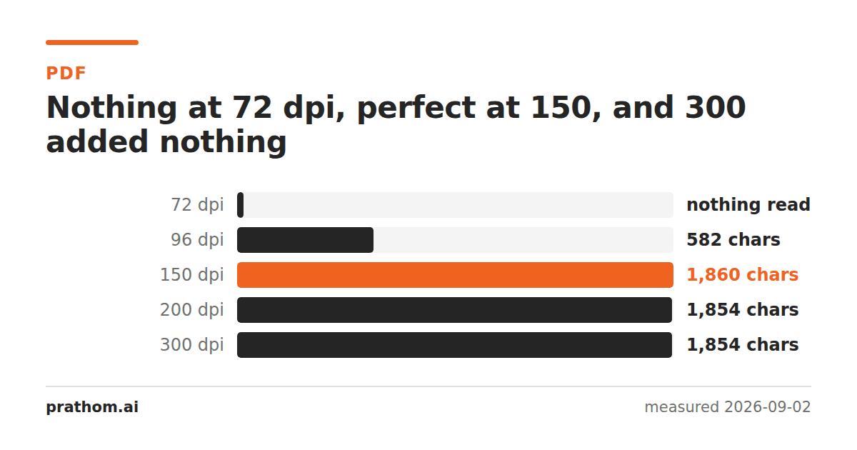
The same page of text, rendered at five resolutions and passed through Tesseract:
| resolution | characters read | key words found |
|---|---|---|
| 72 DPI | 0 | 0 of 7 |
| 96 DPI | 582 | 0 of 7 |
| 150 DPI | 1,860 | 7 of 7 |
| 200 DPI | 1,854 | 7 of 7 |
| 300 DPI | 1,854 | 7 of 7 |
Three distinct regimes, and only one of them is a gradient.
The three regimes
Below about 100 DPI: nothing. At 72 DPI the engine returned an empty string. Not mistakes — no output at all. Character strokes at that size are a pixel or less wide, so letters merge into gray blobs and the layout analysis cannot even find lines of text to segment.
Around 96 DPI: worse than nothing. This is the dangerous one. The engine returned 582 characters, so it looks like it worked. Not one of the seven test words was among them. You get a page of plausible-looking garbage, and if you are processing in bulk you will not notice, because the failure has the same shape as success.
150 DPI and above: identical. 150, 200 and 300 DPI produced the same seven of seven words and within six characters of the same output. The extra resolution bought nothing measurable.
So why does everyone say 300?
Because the advice is older than the engines, and because 300 is genuinely right for harder inputs than a clean rendered page.
The 150 DPI floor here applies to clean, high-contrast, ordinary-sized text. Push any of those and the floor rises:
- Small type. OCR accuracy tracks the pixel height of a character, not the DPI of the page. Roughly 20 pixels of x-height is where engines are comfortable. At 150 DPI a 10-point font gives you about that; a 6-point footnote does not, and needs 300 to reach the same pixel height.
- Poor originals. Faded thermal receipts, fax output, third-generation photocopies, colored or textured paper. More pixels give the engine more evidence to work with when the evidence is bad.
- Dense or unusual scripts. Scripts with fine diacritics or complex glyphs need more pixels per character than the Latin alphabet.
- Anything you will not scan again. If the original is going back in a box, scan at 300 or 400. Storage is cheaper than re-scanning.
300 DPI is a good default precisely because it is safely above the cliff for all of these. What the measurement adds is that if you are already above the cliff for your content, going higher is not buying accuracy — it is buying file size and processing time.
The practical version
Scanning paper you will keep: 300 DPI. Not because 150 fails on clean text, but because you do not know in advance whether every page is clean text.
Rendering PDFs you already have, to OCR them: 150 is enough for normal body text, and it is roughly four times faster and four times smaller than 300. Check a sample page before committing a large batch.
Anything with small print, tables of figures, or poor contrast: 300, and consider 400 for the worst of it.
Never below 150. The 96 DPI result is the argument. A stage that fails loudly can be retried; a stage that returns confident nonsense poisons whatever you do next.
Check before you batch
The cheapest safeguard is to OCR one representative page and read the output yourself before running two thousand. If you want something automatic, count how many of the extracted words appear in a dictionary — a real page of English lands above 90%, and the 96 DPI garbage above scored close to zero. That single check separates "worked" from "produced output" for almost no effort.
pdftoppm -png -r 150 -f 1 -l 1 -singlefile input.pdf page
tesseract page.png stdout
Run it at 150 and at 300 on the same page and compare. If the outputs match, the extra resolution is costing you time and nothing else.
Resolution is not the only variable, and it is the one people over-tune
Two other things affect OCR accuracy more than the difference between 200 and 300 DPI, and both are usually left alone.
Skew. A page scanned two degrees off straight is measurably harder to read, because line segmentation assumes horizontal baselines. Most OCR engines deskew automatically and most do it well, but a page scanned at five degrees or with a curved spine shadow will lose accuracy that no amount of resolution recovers. Flattening the original against the glass is worth more than doubling the DPI.
Binarisation. Before recognition, the engine converts the page to pure black and white by choosing a threshold. On a clean white page this is trivial. On a page with a gray background, a coffee stain, or uneven lighting from a phone camera, a single global threshold either loses the light text or fills in the dark areas. This is the single most common cause of a scan that looks perfectly readable to a human and produces nonsense — the engine is not working from the image you are looking at.
If you are scanning with a phone rather than a scanner, dealing with the lighting does more for accuracy than any setting. Even light, no shadow across the page, and the camera parallel to the paper rather than at an angle.
What a wrong result costs later
The reason to care about the 96 DPI case specifically is what happens downstream. Text extracted from a scan usually feeds something else — a search index, a spreadsheet, a data-entry pipeline, an archive. All of those treat the extracted text as fact. A page that produced nothing gets noticed the first time somebody searches for it. A page that produced 582 characters of plausible garbage gets indexed, searched, and returned as a confident answer to a question it has nothing to do with.
That asymmetry is the reason to set the floor generously rather than tightly. The saving from scanning at 96 instead of 150 is real and small. The cost of the failure mode it opens is real and unbounded.