Which Favicon Sizes You Actually Need
Most favicon guides list a dozen sizes and explain none of them. Only a few are ever actually drawn, the rest are cargo from an older web, and knowing which is which turns an afternoon of exporting into about five minutes.
The sizes that get drawn
A favicon is not one picture. It is a set, and each member is drawn somewhere specific:
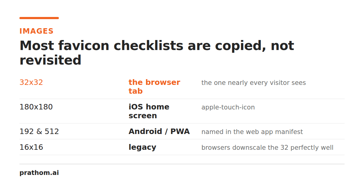
- 16 pixels — the browser tab at ordinary pixel density. This is the one almost every visitor sees, and it is the smallest thing your brand ever has to survive being reduced to.
- 32 pixels — the same tab on a high-density display, plus bookmark lists and several desktop surfaces.
- 48 pixels — larger shortcut and taskbar contexts on Windows.
Those three fit inside a single .icofile, because ICO is a container rather
than an image format. That is the whole reason a format from the 1990s is still
in every site's root: one request, one file, and the browser picks the entry
that matches the surface it is about to paint.
Beyond that, two more do real work, and they are PNGs rather than ICO entries:
- 180 pixels — the icon iOS uses when someone adds your site to their home
screen, declared with
apple-touch-icon. - 192 and 512 pixels — the sizes a web app manifest wants for install prompts and splash screens.
That is the whole list. Five sizes, in two files plus a manifest.
The sizes you can skip
Favicon checklists have accumulated entries the way a garage accumulates cable.
Long lists of apple-touch-icon-precomposedvariants at seven sizes,
msapplicationtile images, 64 and 96 pixel PNGs — these were answers to
specific devices and specific browser versions, and they have been copied
forward long after the things that read them stopped mattering.
Shipping them is not harmful, exactly. It is a folder of files nobody looks at, a set of tags in every page's head, and a small ongoing tax every time the logo changes and someone has to regenerate fourteen files instead of three.
If you inherit a list like that, the test is simple: can you name the surface that draws it? If not, it can go.
Why the 16-pixel version decides everything
Sixteen pixels square is 256 pixels in total. That is fewer pixels than a single character of this sentence occupies on your screen.
Two things follow. Detail does not survive — gradients flatten, thin strokes either vanish or turn into gray mush, and lettering stops being legible as lettering. And contrast carries further than shape: a dark form on a light field stays recognizable when it is reduced to almost nothing, while two mid-tones next to each other become one gray square.
The practical consequence is that the 16-pixel entry should not be your logo scaled down. It should be a decision about what part of your logo survives at that size — usually a single letter, a single shape, or nothing but the silhouette. Design it at 16 and scale up if you must, rather than designing at 512 and hoping.
The failure mode is easy to miss because you will always be looking at your favicon at 400 percent in an editor, where it looks fine. Look at it in a real tab, next to real tabs, before you ship it.
Do you still need favicon.ico at the root?
Yes, and the reason is not tradition.
Browsers request /favicon.icowhether or not your HTML mentions it. Something
will be requested from that path — the only question is whether it returns an
icon or a 404. Feed readers, link previewers, and a long tail of tools that
never learned to parse your <link>tags all go straight there too.
So the root file is the floor, not the ceiling. Declaring it explicitly on top
of that lets you control caching and stops a stale icon outliving a redesign,
which is the single most common favicon complaint: the old logo that will not
go away. The PNG to ICO converterwrites all three entries into
one file, and its page covers the exact <link>declarations to pair with it.
A five-minute version
- Take your logo and decide what survives at 16 pixels. Simplify until it does.
- Export that at 512 pixels square, as a PNG with a transparent background.
- Convert it to a multi-size
.icoand put the result at your site root. - Export the same source at 180 for
apple-touch-icon, and at 192 and 512 for the manifest. - Open a real tab and look at it.
Step five is the one people skip, and it is the only one that tells you whether any of the rest worked.
What none of this fixes
A favicon cannot make a bad mark legible. If a logo depends on a wordmark, on fine detail, or on two colors of similar brightness, no amount of exporting fixes what happens at 16 pixels — the mark itself has to change, or the favicon has to be a different mark that belongs to the same family.
That is a design decision rather than an export setting, and it is worth making deliberately rather than discovering it in a tab six months later.