Turn a Photo into a Cartoon
Cartooning is two operations, not one. Simplifying throws information away. Exaggerating puts identity back, by pushing whatever makes a face unusual further in the direction it already leans — which is why a good caricature can be more recognizable than the photograph it came from. This workflow asks for the simplifying half and asks for the features to stay faithful, and the gap between those two requests explains most of what you will see.
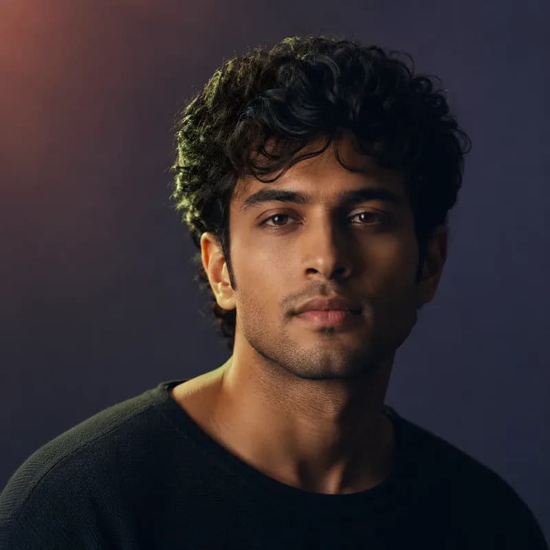

A real run of this tool, not a mock-up. Your result will differ.
Use this without the search next time. Prathom Workbench puts Prathom's tools in your toolbar.
Add to Chrome — freeDrop an image here, or click to browse
Up to 25 MB. Uploaded temporarily, deleted after processing.
What it does
- Simplified shapes with controlled outlines
- Expressive features without caricature
- Coherent illustrated background
- Roughly one megapixel output
How to use Cartoon Generator
- 1
Use a photo with a definite expression
Cartooning amplifies expression more reliably than it amplifies features. A neutral face gives it the least to work with and returns the blandest result.
- 2
Generate the illustration
The photo is read at about one megapixel and redrawn as a cartoon, keeping the subject identity and composition.
- 3
Expect recognizable rather than distinctive
The result will look like a competent illustration of someone who resembles you. Judge whether that is enough for the use before looking for a better run.
How it works
Your photo is scaled so its total area is around one megapixel, keeping the original proportions. An image-editing model reads that copy alongside an instruction describing a clean illustrated cartoon: simplified shapes, expressive but faithful features, controlled outlines, and a coherent background, with the subject identity and composition preserved.
A second instruction rules out distorted identity, extra limbs, malformed hands, unreadable text, watermarks, and unrelated objects.
The model redraws at high strength. Each run begins from fresh noise, so a second attempt gives a different illustration rather than the same one again.
Simplifying and exaggerating are opposites
The interesting thing about cartooning is that it does two contradictory things at once, and only one of them is asked for here.
Simplification removes. Fewer tones, fewer edges, no skin texture, no small detail. It is what makes a cartoon readable at any size and it has a cost: every face has its unusual measurements averaged down along with everything else, so simplification on its own pushes every subject towards the same generic face.
Exaggeration does the reverse. A caricaturist works out how your face departs from an average one — a longer jaw, wider-set eyes, a stronger brow — and pushes each of those departures further. The result is measurably less accurate than a photograph and frequently faster to recognize, because the identifying information has been amplified rather than merely retained.
Real cartooning does both, and the exaggeration is what pays for the simplification.
This workflow is asked for simplified shapes with faithful features, and the negative instruction explicitly bars distorted identity. Both of those block the amplifying half. What remains is the subtractive half, running alone.
That is a defensible default — nobody wants an automatic caricature of themselves or their family — and it explains the characteristic result. Clean, appealing, competent, and slightly generic.
Cartoon is not one style
The other reason results feel non-specific is that the target is unusually vague.
Anime is a definable tradition with shared conventions. Comic art has a recognizable set of printing-derived signatures. Cartoon covers a century of work that agrees on almost nothing: newspaper strips, mid-century animation, modern television, editorial drawing, children's books, vector mascots. These share a family resemblance and very little else.
A model asked for a cartoon has no narrow target to hit, so it produces something near the center of everything it has seen labeled that way. The output tends to be a clean, contemporary, vector-adjacent illustration, because that is what the middle of the distribution looks like.
If you want a specific tradition, this page will not aim at it, and the reason is the word rather than the model.
Line weight is the missing craft
There is one concrete, visible thing that separates these results from drawn work.
In a drawing, line thickness carries meaning. The outer silhouette gets the heaviest line. Interior forms get lighter ones. A shadowed edge gets weight; an edge in light gets almost none. The eye reads that hierarchy without noticing it, and it is a large part of why a drawing feels authored.
Generated outlines are largely uniform. Every edge arrives at roughly the same weight, so nothing is emphasized, and the picture flattens into an even field of outlined regions.
This is the difference people are noticing when they say a result looks like clip art without being able to say why. It is not the colors or the shapes. It is that nothing in the line is telling you where to look.
Publication gate
This page ships once the workflow has been run against a portrait with a strong expression, a neutral portrait, a group photograph, and a subject with unusual facial proportions, with likeness compared to the source in each case.
Examples
Portrait with a clear expression
The strongest case. Expression survives simplification intact and does most of the work of making the result feel like a particular person.
Group or scene
Groups convert pleasantly and individually less faithfully. The scene reads correctly while each face drifts towards the same general treatment.
Frequently asked questions
Why does everyone come out looking a bit similar?
Because simplification without exaggeration converges. Removing detail moves every face towards the average face, and nothing in the instruction pushes back the other way, so distinctive noses and unusual proportions get quietly normalized. Caricaturists solve this by amplifying the deviation, which is precisely the step this workflow is told not to take.
How is this different from the anime or comic pages?
Anime replaces your facial structure with a fixed stylised scheme, and comic art keeps photographic structure and adds ink and printed shading over it. This sits between them — it simplifies the forms themselves but keeps human proportions, so it is the loosest of the three and the least committed to any particular tradition.
Can I get a proper caricature instead?
Not from this page. The instruction asks for expressive but faithful features and the negative prompt rules out distorted identity, so the exaggeration a caricature depends on is blocked from both directions. That is the right default for most uses, since an unrequested caricature of somebody is rarely welcome.
Why do the outlines look flat and even?
Because line weight is a hierarchy decision that generation does not really make. A person drawing puts heavy line on the silhouette and lighter line inside, so the eye learns what matters. Uniform outlines give everything equal emphasis, which is the main reason generated cartoons read as clip art rather than as drawings.
Is the AI Cartoon Generator tool free, and do I need an account?
Yes, free and without registration. Everyone is served the same cartoon generator workflow, at the same quality, with no watermark and no trial that runs out. An upload can be up to 25 MB. The one thing worth knowing is that the result is temporary by design, so download it rather than bookmarking the job and returning tomorrow.